

conformalforecast.diagnostics is
how you check it. This page covers the two ways to run an evaluation,
the metrics worth looking at, and the one measurement that will lie to
you.
The two modes
Both take the fitted object a method’scalibrate / calibrate_cv
returns.
evaluate(fitted, histories, truths)— roll the fitted object over held-out windows it has never seen. This is the honest one.evaluate_calibration(fitted)— replay the method’s own calibration data through the state its own calibration implied at each window. Cheap, requires no holdout, and in sample — so it is flattered by construction and does not track the target. Treat it as a plumbing check, never as a result.
Report.
The optimistic measurement
The two disagree, and the size of the gap is the point. Run both against the same fitted method:evaluate_calibration replays the windows the
method calibrated on, evaluate rolls it over a holdout it has never
seen.
evaluate_calibrationis a smoke test, not a result It scores the method on the very windows it calibrated on, so it is measuring how well a quantile fits the sample it was taken from. For split conformal the answer is “by construction, about right” — which tells you the plumbing works and nothing about whether the interval will hold next month. Online methods are flattered further still: the replay is in sample with respect to the state that adapted on that same stream. SPCI is the extreme case — its interval is conditional on the residual window immediately before the step, so its replay re-queries each window’s own history rather than broadcasting the final answer. Because its quantile regressors were fit on the very residual rows that replay then queries, the figure can sit near 100% while a holdout puts the same method well below target — so for SPCI in particular, do not read the number as coverage. Windows it cannot reach that way, the firstwindow_sizeof each series, are excluded rather than counted as misses;Report.n_evaluated_cellssays how many cells the numbers came from. Use it to check that a pipeline runs. Reportevaluate.
What a report contains
summary() is the human-readable digest. The Report object also
carries the raw intervals, truths and points arrays, so any metric
the module exposes can be recomputed from it — which is what the rest of
this page does.
Coverage, sliced
Marginal coverage is one number over every cell. It is the headline, and it hides the two things most likely to be wrong.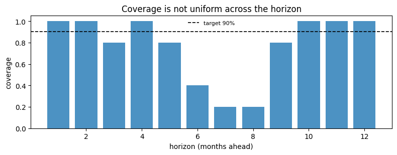
Width, and why coverage alone is useless
A very large interval can cover everything, so any coverage number has to be read next to a width.2/alpha times how far outside it the
truth landed. Lower is better, and unlike coverage it cannot be gamed by
widening.
Comparing methods
The point of a single-number score is that it ranks. Here are three methods on the same holdout.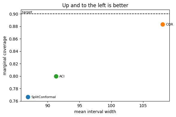
Coverage over time
For an online method the question is not “what was the coverage” but “when was it wrong”.rolling_coverage answers that, with one shape
subtlety worth knowing first.
(n_series, n_samples - window + 1, horizon). Five holdout windows with
a window of 3 therefore gives 3 values for each of the 12 horizon
steps, not one line.
What we want is calendar time. The five holdout windows are contiguous,
non-overlapping 12-month blocks in chronological order, so their 60
cells are the last 60 months of the series. Reshaping to one month per
sample turns the rolling window into a rolling year.
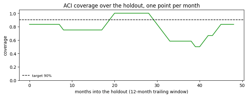
alpha_t is driven to zero, the interval
widens without bound, and the coverage is bought by predicting
“somewhere between minus and plus infinity”. AgACI
is the sturdier answer — it runs several learning rates at once and lets
an aggregator discard the ones that blow up.
This view mixes lead times Flattening blends the 1-month-ahead cell of each block with its 12-month-ahead cell, so a dip may be a bad month or a bad lead time. That is the right view for “how did the deployed interval behave over the year”, which is what a pipeline re-forecasting annually actually experiences, and the wrong view for isolating a horizon step —coverage_by_horizonis for that. When every prediction shares one lead time, as on the online updating page, the distinction disappears androlling_coverageneeds no reshape.
Everything else in the module
Not shown above, but available and documented in the diagnostics API reference:coverage_per_cell— the full(n_series, horizon)grid behind the two reductions used here.coverage_by_magnitude_bin— coverage against the size of the truth, which finds the “we only miss on big values” failure.coverage_by_group— coverage against any grouping you supply, for panels with categories.pinball_loss— per-quantile loss, for comparing quantile forecasts directly.method_stateand its per-method siblingsaci_state,agaci_state,nexcp_state,spci_state— the internal state of an online method, used on the ACI and AgACI pages.
Next
- Methods overview — choosing what to measure.
- Online updating — keeping a method honest as data arrives.
- Ragged panels — per-series diagnostics when series differ in length.