> ## Documentation Index
> Fetch the complete documentation index at: https://nixtlaverse.nixtla.io/llms.txt
> Use this file to discover all available pages before exploring further.
# Anomaly Detection
> In this notebook, we’ll implement anomaly detection in time series
> data
> **Prerequisites**
>
> This tutorial assumes basic familiarity with StatsForecast. For a
> minimal example visit the [Quick
> Start](../getting-started/getting_started_short.html)
## Introduction
Anomaly detection is a crucial task in time series forecasting. It
involves identifying unusual observations that don’t follow the expected
dataset patterns. Anomalies, also known as outliers, can be caused by a
variety of factors, such as errors in the data collection process,
sudden changes in the underlying patterns of the data, or unexpected
events. They can pose problems for many forecasting models since they
can distort trends, seasonal patterns, or autocorrelation estimates. As
a result, anomalies can have a significant impact on the accuracy of the
forecasts, and for this reason, it is essential to be able to identify
them. Furthermore, anomaly detection has many applications across
different industries, such as detecting fraud in financial data,
monitoring the performance of online services, or identifying usual
patterns in energy usage.
By the end of this tutorial, you’ll have a good understanding of how to
detect anomalies in time series data using
[StatsForecast](../../index.html)’s probabilistic models.
**Outline:**
1. Install libraries
2. Load and explore data
3. Train model
4. Recover insample forecasts and identify anomalies
> **Important**
>
> Once an anomaly has been identified, we must decide what to do with
> it. For example, we could remove it or replace it with another value.
> The correct course of action is context-dependent and beyond this
> notebook’s scope. Removing an anomaly will likely improve the accuracy
> of the forecast, but it can also underestimate the amount of
> randomness in the data.
> **Tip**
>
> You can use Colab to run this Notebook interactively
>
>
>  >
## Install libraries
We assume that you have StatsForecast already installed. If not, check
this guide for instructions on [how to install
StatsForecast](../getting-started/installation.html)
Install the necessary packages using `pip install statsforecast`
```python theme={null}
pip install statsforecast -U
```
## Load and explore the data
For this example, we’ll use the hourly dataset of the [M4
Competition](https://www.sciencedirect.com/science/article/pii/S0169207019301128).
```python theme={null}
import pandas as pd
```
```python theme={null}
df_total = pd.read_parquet('https://datasets-nixtla.s3.amazonaws.com/m4-hourly.parquet')
df_total.head()
```
| | unique\_id | ds | y |
| - | ---------- | -- | ----- |
| 0 | H1 | 1 | 605.0 |
| 1 | H1 | 2 | 586.0 |
| 2 | H1 | 3 | 586.0 |
| 3 | H1 | 4 | 559.0 |
| 4 | H1 | 5 | 511.0 |
The input to StatsForecast is always a data frame in [long
format](https://www.theanalysisfactor.com/wide-and-long-data/) with
three columns: `unique_id`, `ds` and `y`.
* `unique_id`: (string, int or category) A unique identifier for the
series.
* `ds`: (timestamp or int) A timestamp in format YYYY-MM-DD or
YYYY-MM-DD HH:MM:SS or an integer indexing time.
* `y`: (numeric) The measurement we wish to forecast.
From this dataset, we’ll select the first 8 time series to reduce the
total execution time. You can select any number you want by changing the
value of `n_series`.
```python theme={null}
n_series = 8
uids = df_total['unique_id'].unique()[:n_series]
df = df_total.query('unique_id in @uids')
```
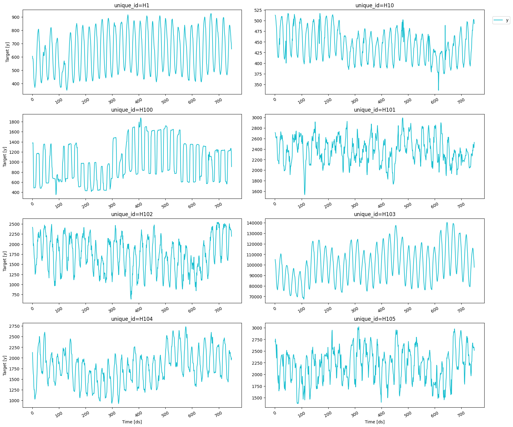
We can plot these series using the `plot_series` function from the
`utilsforecast` package. This function has multiple parameters, and the
required ones to generate the plots in this notebook are explained
below.
* `df`: A pandas dataframe with columns \[unique\_id, ds, y].
* `forecasts_df`: A pandas dataframe with columns \[unique\_id, ds]
and models.
* `ids`: A list with the ids of the time series we want to plot.
* `level`: Prediction interval levels to plot.
* `plot_anomalies`: Whether or not to include the anomalies for each
prediction interval.
```python theme={null}
from statsforecast import StatsForecast
from utilsforecast.plotting import plot_series
```
```python theme={null}
plot_series(df)
```
>
## Install libraries
We assume that you have StatsForecast already installed. If not, check
this guide for instructions on [how to install
StatsForecast](../getting-started/installation.html)
Install the necessary packages using `pip install statsforecast`
```python theme={null}
pip install statsforecast -U
```
## Load and explore the data
For this example, we’ll use the hourly dataset of the [M4
Competition](https://www.sciencedirect.com/science/article/pii/S0169207019301128).
```python theme={null}
import pandas as pd
```
```python theme={null}
df_total = pd.read_parquet('https://datasets-nixtla.s3.amazonaws.com/m4-hourly.parquet')
df_total.head()
```
| | unique\_id | ds | y |
| - | ---------- | -- | ----- |
| 0 | H1 | 1 | 605.0 |
| 1 | H1 | 2 | 586.0 |
| 2 | H1 | 3 | 586.0 |
| 3 | H1 | 4 | 559.0 |
| 4 | H1 | 5 | 511.0 |
The input to StatsForecast is always a data frame in [long
format](https://www.theanalysisfactor.com/wide-and-long-data/) with
three columns: `unique_id`, `ds` and `y`.
* `unique_id`: (string, int or category) A unique identifier for the
series.
* `ds`: (timestamp or int) A timestamp in format YYYY-MM-DD or
YYYY-MM-DD HH:MM:SS or an integer indexing time.
* `y`: (numeric) The measurement we wish to forecast.
From this dataset, we’ll select the first 8 time series to reduce the
total execution time. You can select any number you want by changing the
value of `n_series`.
```python theme={null}
n_series = 8
uids = df_total['unique_id'].unique()[:n_series]
df = df_total.query('unique_id in @uids')
```
We can plot these series using the `plot_series` function from the
`utilsforecast` package. This function has multiple parameters, and the
required ones to generate the plots in this notebook are explained
below.
* `df`: A pandas dataframe with columns \[unique\_id, ds, y].
* `forecasts_df`: A pandas dataframe with columns \[unique\_id, ds]
and models.
* `ids`: A list with the ids of the time series we want to plot.
* `level`: Prediction interval levels to plot.
* `plot_anomalies`: Whether or not to include the anomalies for each
prediction interval.
```python theme={null}
from statsforecast import StatsForecast
from utilsforecast.plotting import plot_series
```
```python theme={null}
plot_series(df)
```
 ## Train model
To generate the forecast, we’ll use the
[MSTL](../../src/core/models.html#multipleseasonaltrend) model, which is
well-suited for low-frequency data like the one used here. We first need
to import it from `statsforecast.models` and then we need to instantiate
it. Since we’re using hourly data, we have two seasonal periods: one
every 24 hours (hourly) and one every 24\*7 hours (daily). Hence, we
need to set `season_length = [24, 24*7]`.
```python theme={null}
from statsforecast.models import MSTL
```
```python theme={null}
# Create a list of models and instantiation parameters
models = [MSTL(season_length = [24, 24*7])]
```
To instantiate a new StatsForecast object, we need the following
parameters:
* `models`: The list of models defined in the previous step.
* `freq`: A string or integer indicating the frequency of the data.
See [pandas’ available
frequencies](https://pandas.pydata.org/pandas-docs/stable/user_guide/timeseries.html#offset-aliases).
* `n_jobs`: An integer that indicates the number of jobs used in
parallel processing. Use -1 to select all cores.
```python theme={null}
sf = StatsForecast(
models=models,
freq=1,
n_jobs=-1,
)
```
We’ll now predict the next 48 hours. To do this, we’ll use the
`forecast` method, which requires the following arguments:
* `df`: The dataframe with the training data.
* `h`: The forecasting horizon.
* `level`: The confidence levels of the prediction intervals.
* `fitted`: Return insample predictions.
It is important that we select a `level` and set `fitted=True` since
we’ll need the insample forecasts and their prediction intervals to
detect the anomalies.
```python theme={null}
horizon = 48
levels = [99]
fcst = sf.forecast(df=df, h=48, level=levels, fitted=True)
fcst.head()
```
| | unique\_id | ds | MSTL | MSTL-lo-99 | MSTL-hi-99 |
| - | ---------- | --- | ---------- | ---------- | ---------- |
| 0 | H1 | 749 | 607.607223 | 587.173250 | 628.041196 |
| 1 | H1 | 750 | 552.364253 | 521.069710 | 583.658796 |
| 2 | H1 | 751 | 506.785334 | 465.894977 | 547.675691 |
| 3 | H1 | 752 | 472.906141 | 423.114088 | 522.698195 |
| 4 | H1 | 753 | 452.240231 | 394.064394 | 510.416067 |
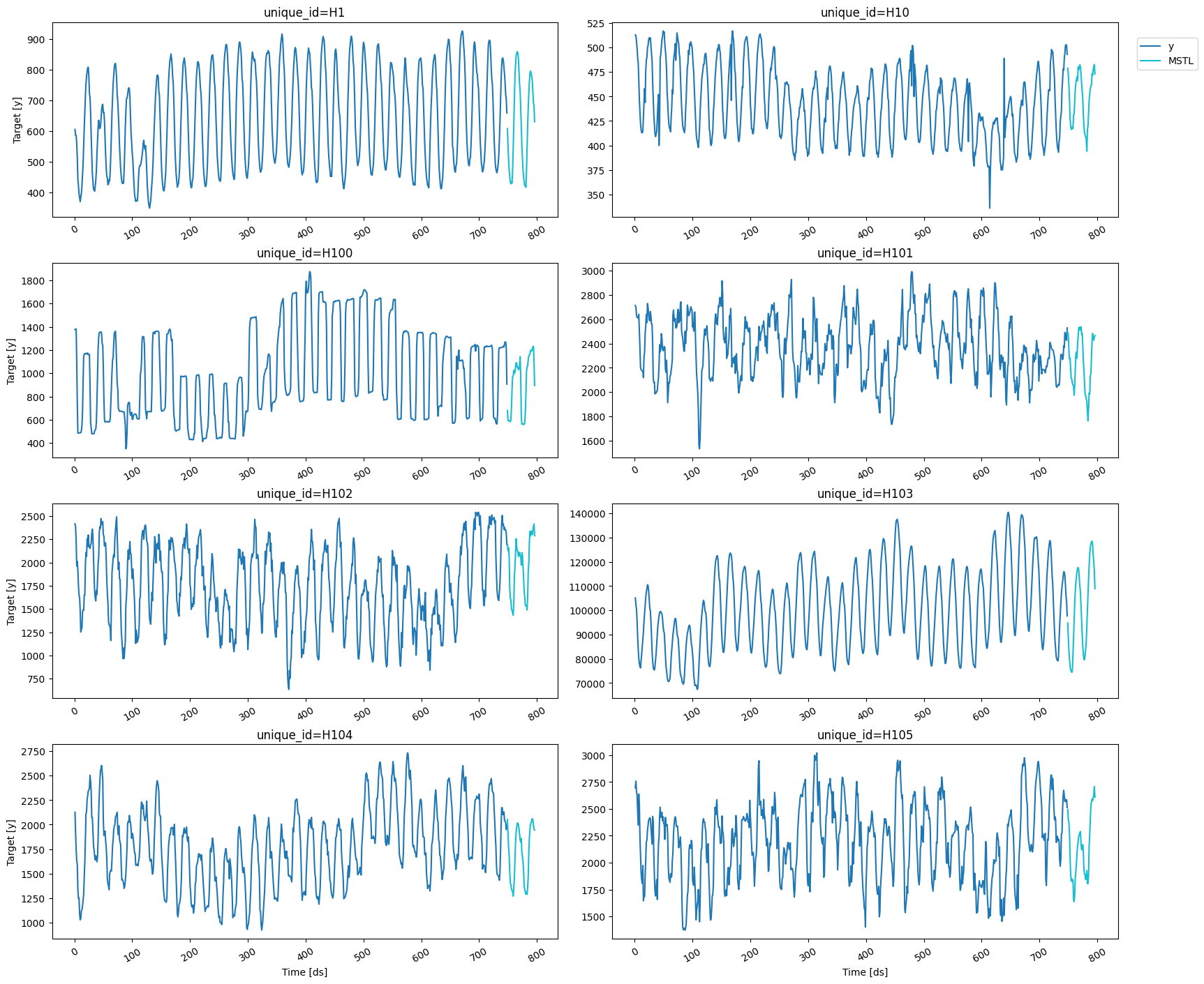
We can plot the forecasts using the `plot_series` function from before.
```python theme={null}
plot_series(df, fcst)
```
## Train model
To generate the forecast, we’ll use the
[MSTL](../../src/core/models.html#multipleseasonaltrend) model, which is
well-suited for low-frequency data like the one used here. We first need
to import it from `statsforecast.models` and then we need to instantiate
it. Since we’re using hourly data, we have two seasonal periods: one
every 24 hours (hourly) and one every 24\*7 hours (daily). Hence, we
need to set `season_length = [24, 24*7]`.
```python theme={null}
from statsforecast.models import MSTL
```
```python theme={null}
# Create a list of models and instantiation parameters
models = [MSTL(season_length = [24, 24*7])]
```
To instantiate a new StatsForecast object, we need the following
parameters:
* `models`: The list of models defined in the previous step.
* `freq`: A string or integer indicating the frequency of the data.
See [pandas’ available
frequencies](https://pandas.pydata.org/pandas-docs/stable/user_guide/timeseries.html#offset-aliases).
* `n_jobs`: An integer that indicates the number of jobs used in
parallel processing. Use -1 to select all cores.
```python theme={null}
sf = StatsForecast(
models=models,
freq=1,
n_jobs=-1,
)
```
We’ll now predict the next 48 hours. To do this, we’ll use the
`forecast` method, which requires the following arguments:
* `df`: The dataframe with the training data.
* `h`: The forecasting horizon.
* `level`: The confidence levels of the prediction intervals.
* `fitted`: Return insample predictions.
It is important that we select a `level` and set `fitted=True` since
we’ll need the insample forecasts and their prediction intervals to
detect the anomalies.
```python theme={null}
horizon = 48
levels = [99]
fcst = sf.forecast(df=df, h=48, level=levels, fitted=True)
fcst.head()
```
| | unique\_id | ds | MSTL | MSTL-lo-99 | MSTL-hi-99 |
| - | ---------- | --- | ---------- | ---------- | ---------- |
| 0 | H1 | 749 | 607.607223 | 587.173250 | 628.041196 |
| 1 | H1 | 750 | 552.364253 | 521.069710 | 583.658796 |
| 2 | H1 | 751 | 506.785334 | 465.894977 | 547.675691 |
| 3 | H1 | 752 | 472.906141 | 423.114088 | 522.698195 |
| 4 | H1 | 753 | 452.240231 | 394.064394 | 510.416067 |
We can plot the forecasts using the `plot_series` function from before.
```python theme={null}
plot_series(df, fcst)
```
 ## Recover insample forecasts and identify anomalies
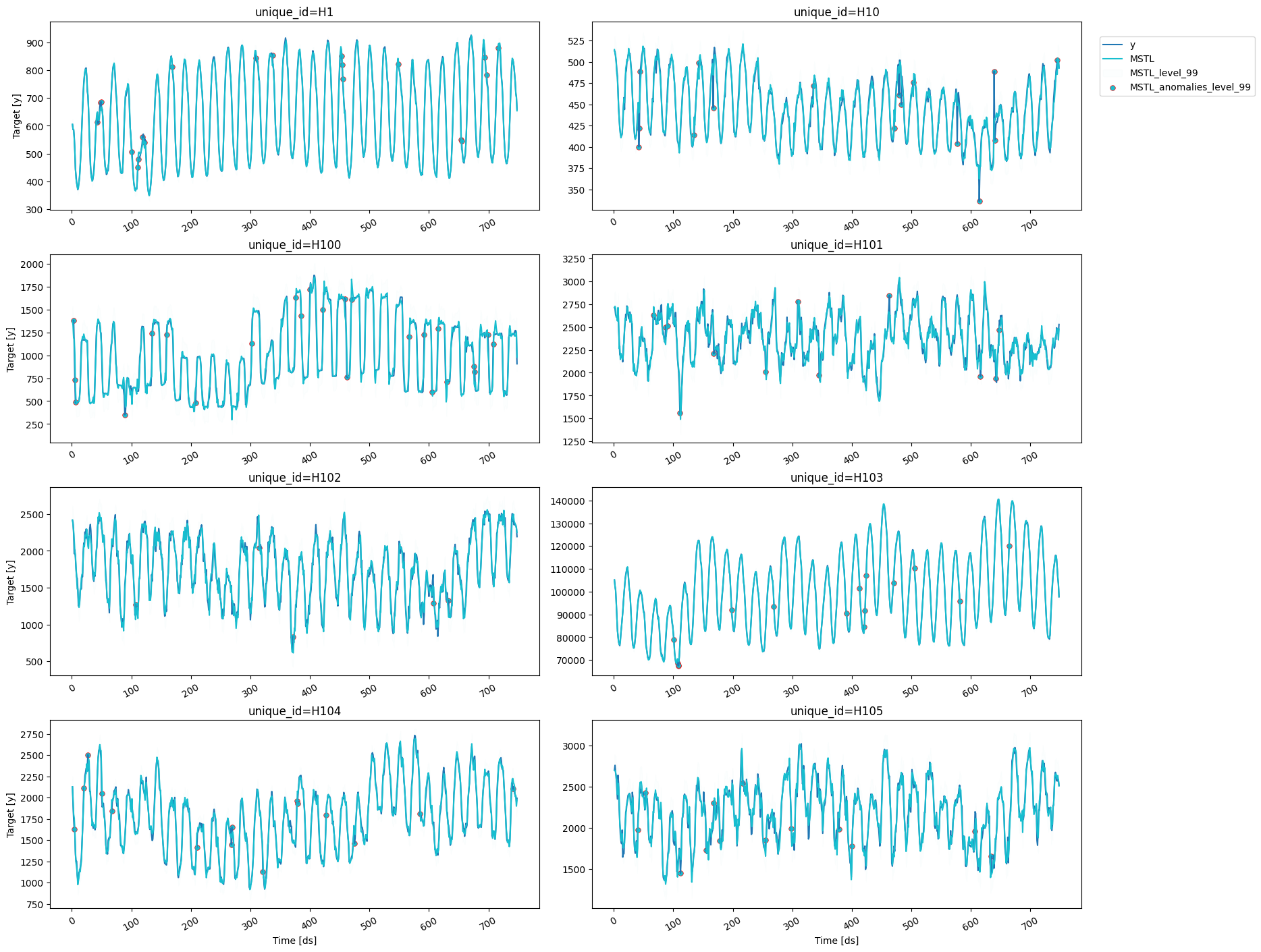
In this example, an **anomaly** will be any observation outside the
prediction interval of the insample forecasts for a given confidence
level (here we selected 99%). Hence, we first need to recover the
insample forecasts using the `forecast_fitted_values` method.
```python theme={null}
insample_forecasts = sf.forecast_fitted_values()
insample_forecasts.head()
```
| | unique\_id | ds | y | MSTL | MSTL-lo-99 | MSTL-hi-99 |
| - | ---------- | -- | ----- | ---------- | ---------- | ---------- |
| 0 | H1 | 1 | 605.0 | 605.098607 | 584.678408 | 625.518805 |
| 1 | H1 | 2 | 586.0 | 588.496673 | 568.076474 | 608.916872 |
| 2 | H1 | 3 | 586.0 | 585.586856 | 565.166657 | 606.007054 |
| 3 | H1 | 4 | 559.0 | 554.012377 | 533.592178 | 574.432576 |
| 4 | H1 | 5 | 511.0 | 510.153508 | 489.733309 | 530.573707 |
We can now find all the observations above or below the 99% prediction
interval for the insample forecasts.
```python theme={null}
anomalies = insample_forecasts[~insample_forecasts['y'].between(insample_forecasts['MSTL-lo-99'], insample_forecasts['MSTL-hi-99'])]
anomalies.head()
```
| | unique\_id | ds | y | MSTL | MSTL-lo-99 | MSTL-hi-99 |
| --- | ---------- | --- | ----- | ---------- | ---------- | ---------- |
| 42 | H1 | 43 | 613.0 | 649.404871 | 628.984672 | 669.825069 |
| 47 | H1 | 48 | 683.0 | 662.245526 | 641.825328 | 682.665725 |
| 48 | H1 | 49 | 687.0 | 655.382320 | 634.962122 | 675.802519 |
| 100 | H1 | 101 | 507.0 | 484.934230 | 464.514031 | 505.354428 |
| 110 | H1 | 111 | 451.0 | 474.899006 | 454.478808 | 495.319205 |
We can plot the anomalies by setting the `level` and the
`plot_anomalies` arguments of the `plot_series` function.
```python theme={null}
plot_series(forecasts_df=insample_forecasts, level=levels, plot_anomalies=True)
```
## Recover insample forecasts and identify anomalies
In this example, an **anomaly** will be any observation outside the
prediction interval of the insample forecasts for a given confidence
level (here we selected 99%). Hence, we first need to recover the
insample forecasts using the `forecast_fitted_values` method.
```python theme={null}
insample_forecasts = sf.forecast_fitted_values()
insample_forecasts.head()
```
| | unique\_id | ds | y | MSTL | MSTL-lo-99 | MSTL-hi-99 |
| - | ---------- | -- | ----- | ---------- | ---------- | ---------- |
| 0 | H1 | 1 | 605.0 | 605.098607 | 584.678408 | 625.518805 |
| 1 | H1 | 2 | 586.0 | 588.496673 | 568.076474 | 608.916872 |
| 2 | H1 | 3 | 586.0 | 585.586856 | 565.166657 | 606.007054 |
| 3 | H1 | 4 | 559.0 | 554.012377 | 533.592178 | 574.432576 |
| 4 | H1 | 5 | 511.0 | 510.153508 | 489.733309 | 530.573707 |
We can now find all the observations above or below the 99% prediction
interval for the insample forecasts.
```python theme={null}
anomalies = insample_forecasts[~insample_forecasts['y'].between(insample_forecasts['MSTL-lo-99'], insample_forecasts['MSTL-hi-99'])]
anomalies.head()
```
| | unique\_id | ds | y | MSTL | MSTL-lo-99 | MSTL-hi-99 |
| --- | ---------- | --- | ----- | ---------- | ---------- | ---------- |
| 42 | H1 | 43 | 613.0 | 649.404871 | 628.984672 | 669.825069 |
| 47 | H1 | 48 | 683.0 | 662.245526 | 641.825328 | 682.665725 |
| 48 | H1 | 49 | 687.0 | 655.382320 | 634.962122 | 675.802519 |
| 100 | H1 | 101 | 507.0 | 484.934230 | 464.514031 | 505.354428 |
| 110 | H1 | 111 | 451.0 | 474.899006 | 454.478808 | 495.319205 |
We can plot the anomalies by setting the `level` and the
`plot_anomalies` arguments of the `plot_series` function.
```python theme={null}
plot_series(forecasts_df=insample_forecasts, level=levels, plot_anomalies=True)
```
 If we want to take a closer look, we can use the `ids` argument to
select one particular time series, for example, `H10`.
```python theme={null}
plot_series(forecasts_df=insample_forecasts, level=[99], plot_anomalies=True, ids=['H10'])
```
If we want to take a closer look, we can use the `ids` argument to
select one particular time series, for example, `H10`.
```python theme={null}
plot_series(forecasts_df=insample_forecasts, level=[99], plot_anomalies=True, ids=['H10'])
```
 Here we identified the anomalies in the data using the MSTL model, but
any [probabilistic model](../../src/core/models.html) from StatsForecast
can be used. We also selected the 99% prediction interval of the
insample forecasts, but other confidence levels can be used as well.
Here we identified the anomalies in the data using the MSTL model, but
any [probabilistic model](../../src/core/models.html) from StatsForecast
can be used. We also selected the 99% prediction interval of the
insample forecasts, but other confidence levels can be used as well.