> ## Documentation Index
> Fetch the complete documentation index at: https://nixtlaverse.nixtla.io/llms.txt
> Use this file to discover all available pages before exploring further.
# CrostonOptimized Model
> Step-by-step guide on using the `CrostonOptimized Model` with
> `Statsforecast`.
During this walkthrough, we will become familiar with the main
`StatsForecast` class and some relevant methods such as
`StatsForecast.plot`, `StatsForecast.forecast` and
`StatsForecast.cross_validation` in other.
The text in this article is largely taken from: 1. [Changquan Huang •
Alla Petukhina. Springer series (2022). Applied Time Series Analysis and
Forecasting with
Python.](https://link.springer.com/book/10.1007/978-3-031-13584-2) 2.
Ivan Svetunkov. [Forecasting and Analytics with the Augmented Dynamic
Adaptive Model (ADAM)](https://openforecast.org/adam/) 3. [James D.
Hamilton. Time Series Analysis Princeton University Press, Princeton,
New Jersey, 1st Edition,
1994.](https://press.princeton.edu/books/hardcover/9780691042893/time-series-analysis)
4\. [Rob J. Hyndman and George Athanasopoulos (2018). “Forecasting
Principles and Practice (3rd ed)”](https://otexts.com/fpp3/tscv.html).
## Table of Contents
* [Introduction](#introduction)
* [Croston Optimized Model](#model)
* [Loading libraries and data](#loading)
* [Explore data with the plot method](#plotting)
* [Split the data into training and testing](#splitting)
* [Implementation of CrostonOptimized with
StatsForecast](#implementation)
* [Cross-validation](#cross_validate)
* [Model evaluation](#evaluate)
* [References](#references)
## Introduction
The Croston Optimized model is a forecasting method designed for
intermittent demand time series data. It is an extension of the
Croston’s method, which was originally developed for forecasting
sporadic demand patterns.
Intermittent demand time series are characterized by irregular and
sporadic occurrences of non-zero demand values, often with long periods
of zero demand. Traditional forecasting methods may struggle to handle
such patterns effectively.
The Croston Optimized model addresses this challenge by incorporating
two key components: exponential smoothing and intermittent demand
estimation.
1. Exponential Smoothing: The Croston Optimized model uses exponential
smoothing to capture the trend and seasonality in the intermittent
demand data. This helps in identifying the underlying patterns and
making more accurate forecasts.
2. Intermittent Demand Estimation: Since intermittent demand data often
consists of long periods of zero demand, the Croston Optimized model
employs a separate estimation process for the occurrence and size of
non-zero demand values. It estimates the probability of occurrence
and the average size of non-zero demand intervals, enabling better
forecasting of intermittent demand.
The Croston Optimized model aims to strike a balance between
over-forecasting and under-forecasting intermittent demand, which are
common challenges in traditional forecasting methods. By explicitly
modeling intermittent demand patterns, it can provide more accurate
forecasts for intermittent demand time series data.
It is worth noting that there are variations and adaptations of the
Croston Optimized model, with different modifications and enhancements
made to suit specific forecasting scenarios. These variations may
incorporate additional features or algorithms to further improve the
accuracy of the forecasts.
## Croston Optimized method
The Croston Optimized model can be mathematically defined as follows:
1. Initialization:
* Let $(y_t)$ represent the intermittent demand time series data
at time $t$.
* Initialize two sets of variables: $(p_t)$ for the probability of
occurrence and $(q_t)$ for the average size of non-zero demand
intervals.
* Initialize the forecast $(F_t)$ and forecast error $(E_t)$
variables as zero.
2. Calculation of $(p_t)$ and $(q_t)$:
* Calculate the intermittent demand occurrence probability $(p_t)$
using exponential smoothing:
$[p_t = \alpha + (1 - \alpha)(p_{t-1}),]$ where $(\alpha)$ is
the smoothing parameter (typically set between 0.1 and 0.3).
* Calculate the average size of non-zero demand intervals $(q_t)$
using exponential smoothing:
$[q_t = \beta \cdot y_t + (1 - \beta)(q_{t-1}),]$ where
$(\beta)$ is the smoothing parameter (typically set between 0.1
and 0.3).
3. Forecasting:
* If $(y_t > 0)$ (non-zero demand occurrence):
* Calculate the forecast $(F_t)$ as the previous forecast
$(F_{t-1})$ divided by the average size of non-zero demand
intervals $(q_{t-1})$:
$[F_t = \frac{{F_{t-1}}}{{q_{t-1}}}]$
* Calculate the forecast error $(E_t)$ as the difference
between the actual demand $(y_t)$ and the forecast $(F_t)$:
$[E_t = y_t - F_t]$
* If $(y_t = 0)$ (zero demand occurrence):
* Set the forecast $(F_t)$ and forecast error $(E_t)$ as zero.
4. Updating the model:
* Update the intermittent demand occurrence probability $(p_t)$
and the average size of non-zero demand intervals $(q_t)$ using
exponential smoothing as described in step 2.
5. Repeat steps 3 and 4 for each time point in the time series.
The Croston Optimized model leverages exponential smoothing to capture
the trend and seasonality in the intermittent demand data, and it
estimates the occurrence probability and average size of non-zero demand
intervals separately to handle intermittent demand patterns effectively.
By updating the model parameters based on the observed data, it provides
improved forecasts for intermittent demand time series.
### Some properties of the Optimized Croston Model
The optimized Croston model is a modification of the classic Croston
model used to forecast intermittent demand. The classic Croston model
forecasts demand using a weighted average of historical orders and the
average interval between orders. The optimized Croston model uses a
probability function to forecast the mean interval between orders.
The optimized Croston model has been shown to be more accurate than the
classical Croston model for time series with irregular demand. The
optimized Croston model is also more adaptable to different types of
intermittent time series.
The optimized Croston model has the following properties:
* It is accurate, even for time series with irregular demand.
* It is adaptable to different types of intermittent time series.
* It is easy to implement and understand.
* It is robust to outliers.
The optimized Croston model has been used successfully to forecast a
wide range of intermittent time series, including product demand,
service demand, and resource demand.
Here are some of the properties of the optimized Croston model:
* **Precision:** The optimized Croston model has been shown to be more
accurate than the classic Croston model for time series with
irregular demand. This is because the optimized Croston model uses a
probability function to forecast the average interval between
orders, which is more accurate than the weighted average of
historical orders.
* **Adaptability:** The optimized Croston model is also more adaptable
to different types of intermittent time series. This is because the
optimized Croston model uses a probability function to forecast the
mean interval between orders, allowing it to accommodate different
demand patterns.
* **Ease of Implementation and Understanding:** The optimized Croston
model is easy to implement and understand. This is because the
optimized Croston model is a modification of the classical Croston
model, which is a well-known and well-understood model.
* **Robustness:** The optimized Croston model is also robust to
outliers. This is because the optimized Croston model uses a
probability function to forecast the mean interval between orders,
which allows it to ignore outliers.
## Loading libraries and data
> **Tip**
>
> Statsforecast will be needed. To install, see
> [instructions](../getting-started/installation.html).
Next, we import plotting libraries and configure the plotting style.
```python theme={null}
import matplotlib.pyplot as plt
import seaborn as sns
from statsmodels.graphics.tsaplots import plot_acf, plot_pacf
import plotly.graph_objects as go
plt.style.use('grayscale') # fivethirtyeight grayscale classic
plt.rcParams['lines.linewidth'] = 1.5
dark_style = {
'figure.facecolor': '#008080', # #212946
'axes.facecolor': '#008080',
'savefig.facecolor': '#008080',
'axes.grid': True,
'axes.grid.which': 'both',
'axes.spines.left': False,
'axes.spines.right': False,
'axes.spines.top': False,
'axes.spines.bottom': False,
'grid.color': '#000000', #2A3459
'grid.linewidth': '1',
'text.color': '0.9',
'axes.labelcolor': '0.9',
'xtick.color': '0.9',
'ytick.color': '0.9',
'font.size': 12 }
plt.rcParams.update(dark_style)
from pylab import rcParams
rcParams['figure.figsize'] = (18,7)
```
```python theme={null}
import pandas as pd
df=pd.read_csv("https://raw.githubusercontent.com/Naren8520/Serie-de-tiempo-con-Machine-Learning/main/Data/intermittend_demand2")
df.head()
```
| | date | sales |
| - | ------------------- | ----- |
| 0 | 2022-01-01 00:00:00 | 0 |
| 1 | 2022-01-01 01:00:00 | 10 |
| 2 | 2022-01-01 02:00:00 | 0 |
| 3 | 2022-01-01 03:00:00 | 0 |
| 4 | 2022-01-01 04:00:00 | 100 |
The input to StatsForecast is always a data frame in long format with
three columns: unique\_id, ds and y:
* The `unique_id` (string, int or category) represents an identifier
for the series.
* The `ds` (datestamp) column should be of a format expected by
Pandas, ideally YYYY-MM-DD for a date or YYYY-MM-DD HH:MM:SS for a
timestamp.
* The `y` (numeric) represents the measurement we wish to forecast.
```python theme={null}
df["unique_id"]="1"
df.columns=["ds", "y", "unique_id"]
df.head()
```
| | ds | y | unique\_id |
| - | ------------------- | --- | ---------- |
| 0 | 2022-01-01 00:00:00 | 0 | 1 |
| 1 | 2022-01-01 01:00:00 | 10 | 1 |
| 2 | 2022-01-01 02:00:00 | 0 | 1 |
| 3 | 2022-01-01 03:00:00 | 0 | 1 |
| 4 | 2022-01-01 04:00:00 | 100 | 1 |
```python theme={null}
print(df.dtypes)
```
```text theme={null}
ds object
y int64
unique_id object
dtype: object
```
We can see that our time variable `(ds)` is in an object format, we need
to convert to a date format
```python theme={null}
df["ds"] = pd.to_datetime(df["ds"])
```
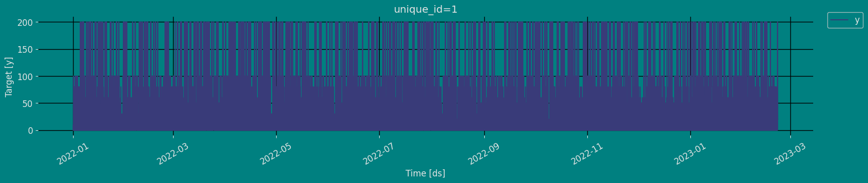
## Explore Data with the plot method
Plot some series using the plot method from the StatsForecast class.
This method prints a random series from the dataset and is useful for
basic EDA.
```python theme={null}
from statsforecast import StatsForecast
StatsForecast.plot(df)
```
 ### Autocorrelation plots
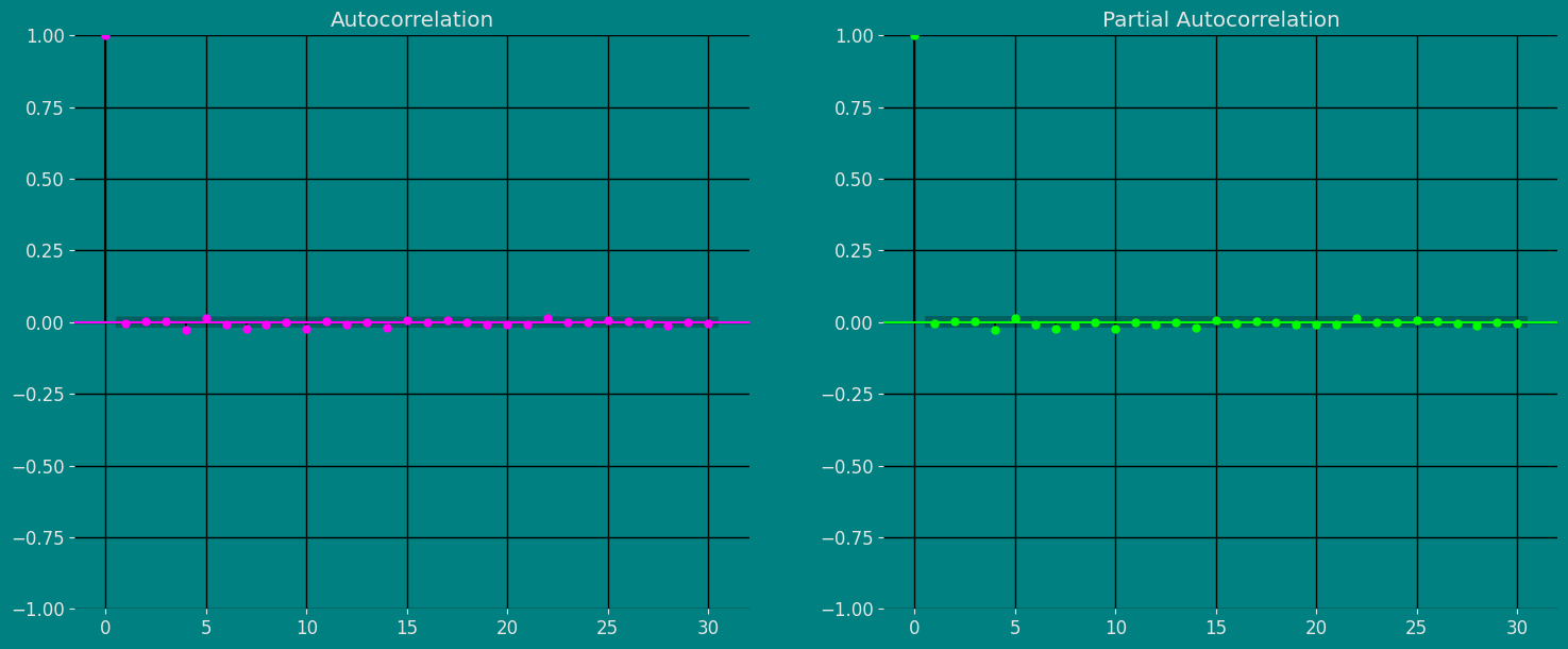
Autocorrelation (ACF) and partial autocorrelation (PACF) plots are
statistical tools used to analyze time series. ACF charts show the
correlation between the values of a time series and their lagged values,
while PACF charts show the correlation between the values of a time
series and their lagged values, after the effect of previous lagged
values has been removed.
ACF and PACF charts can be used to identify the structure of a time
series, which can be helpful in choosing a suitable model for the time
series. For example, if the ACF chart shows a repeating peak and valley
pattern, this indicates that the time series is stationary, meaning that
it has the same statistical properties over time. If the PACF chart
shows a pattern of rapidly decreasing spikes, this indicates that the
time series is invertible, meaning it can be reversed to get a
stationary time series.
The importance of the ACF and PACF charts is that they can help analysts
better understand the structure of a time series. This understanding can
be helpful in choosing a suitable model for the time series, which can
improve the ability to predict future values of the time series.
To analyze ACF and PACF charts:
* Look for patterns in charts. Common patterns include repeating peaks
and valleys, sawtooth patterns, and plateau patterns.
* Compare ACF and PACF charts. The PACF chart generally has fewer
spikes than the ACF chart.
* Consider the length of the time series. ACF and PACF charts for
longer time series will have more spikes.
* Use a confidence interval. The ACF and PACF plots also show
confidence intervals for the autocorrelation values. If an
autocorrelation value is outside the confidence interval, it is
likely to be significant.
```python theme={null}
fig, axs = plt.subplots(nrows=1, ncols=2)
plot_acf(df["y"], lags=30, ax=axs[0],color="fuchsia")
axs[0].set_title("Autocorrelation");
plot_pacf(df["y"], lags=30, ax=axs[1],color="lime")
axs[1].set_title('Partial Autocorrelation')
plt.show();
```
### Autocorrelation plots
Autocorrelation (ACF) and partial autocorrelation (PACF) plots are
statistical tools used to analyze time series. ACF charts show the
correlation between the values of a time series and their lagged values,
while PACF charts show the correlation between the values of a time
series and their lagged values, after the effect of previous lagged
values has been removed.
ACF and PACF charts can be used to identify the structure of a time
series, which can be helpful in choosing a suitable model for the time
series. For example, if the ACF chart shows a repeating peak and valley
pattern, this indicates that the time series is stationary, meaning that
it has the same statistical properties over time. If the PACF chart
shows a pattern of rapidly decreasing spikes, this indicates that the
time series is invertible, meaning it can be reversed to get a
stationary time series.
The importance of the ACF and PACF charts is that they can help analysts
better understand the structure of a time series. This understanding can
be helpful in choosing a suitable model for the time series, which can
improve the ability to predict future values of the time series.
To analyze ACF and PACF charts:
* Look for patterns in charts. Common patterns include repeating peaks
and valleys, sawtooth patterns, and plateau patterns.
* Compare ACF and PACF charts. The PACF chart generally has fewer
spikes than the ACF chart.
* Consider the length of the time series. ACF and PACF charts for
longer time series will have more spikes.
* Use a confidence interval. The ACF and PACF plots also show
confidence intervals for the autocorrelation values. If an
autocorrelation value is outside the confidence interval, it is
likely to be significant.
```python theme={null}
fig, axs = plt.subplots(nrows=1, ncols=2)
plot_acf(df["y"], lags=30, ax=axs[0],color="fuchsia")
axs[0].set_title("Autocorrelation");
plot_pacf(df["y"], lags=30, ax=axs[1],color="lime")
axs[1].set_title('Partial Autocorrelation')
plt.show();
```
 ### Decomposition of the time series
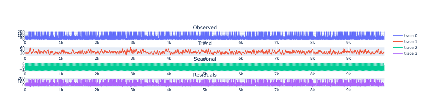
How to decompose a time series and why?
In time series analysis to forecast new values, it is very important to
know past data. More formally, we can say that it is very important to
know the patterns that values follow over time. There can be many
reasons that cause our forecast values to fall in the wrong direction.
Basically, a time series consists of four components. The variation of
those components causes the change in the pattern of the time series.
These components are:
* **Level:** This is the primary value that averages over time.
* **Trend:** The trend is the value that causes increasing or
decreasing patterns in a time series.
* **Seasonality:** This is a cyclical event that occurs in a time
series for a short time and causes short-term increasing or
decreasing patterns in a time series.
* **Residual/Noise:** These are the random variations in the time
series.
Combining these components over time leads to the formation of a time
series. Most time series consist of level and noise/residual and trend
or seasonality are optional values.
If seasonality and trend are part of the time series, then there will be
effects on the forecast value. As the pattern of the forecasted time
series may be different from the previous time series.
The combination of the components in time series can be of two types: \*
Additive \* Multiplicative
### Additive time series
If the components of the time series are added to make the time series.
Then the time series is called the additive time series. By
visualization, we can say that the time series is additive if the
increasing or decreasing pattern of the time series is similar
throughout the series. The mathematical function of any additive time
series can be represented by:
$y(t) = level + Trend + seasonality + noise$
### Multiplicative time series
If the components of the time series are multiplicative together, then
the time series is called a multiplicative time series. For
visualization, if the time series is having exponential growth or
decline with time, then the time series can be considered as the
multiplicative time series. The mathematical function of the
multiplicative time series can be represented as.
$y(t) = Level * Trend * seasonality * Noise$
```python theme={null}
from plotly.subplots import make_subplots
```
```python theme={null}
from statsmodels.tsa.seasonal import seasonal_decompose
def plotSeasonalDecompose(
x,
model='additive',
filt=None,
period=None,
two_sided=True,
extrapolate_trend=0,
title="Seasonal Decomposition"):
result = seasonal_decompose(
x, model=model, filt=filt, period=period,
two_sided=two_sided, extrapolate_trend=extrapolate_trend)
fig = make_subplots(
rows=4, cols=1,
subplot_titles=["Observed", "Trend", "Seasonal", "Residuals"])
for idx, col in enumerate(['observed', 'trend', 'seasonal', 'resid']):
fig.add_trace(
go.Scatter(x=result.observed.index, y=getattr(result, col), mode='lines'),
row=idx+1, col=1,
)
return fig
```
```python theme={null}
plotSeasonalDecompose(
df["y"],
model="additive",
period=24,
title="Seasonal Decomposition")
```
### Decomposition of the time series
How to decompose a time series and why?
In time series analysis to forecast new values, it is very important to
know past data. More formally, we can say that it is very important to
know the patterns that values follow over time. There can be many
reasons that cause our forecast values to fall in the wrong direction.
Basically, a time series consists of four components. The variation of
those components causes the change in the pattern of the time series.
These components are:
* **Level:** This is the primary value that averages over time.
* **Trend:** The trend is the value that causes increasing or
decreasing patterns in a time series.
* **Seasonality:** This is a cyclical event that occurs in a time
series for a short time and causes short-term increasing or
decreasing patterns in a time series.
* **Residual/Noise:** These are the random variations in the time
series.
Combining these components over time leads to the formation of a time
series. Most time series consist of level and noise/residual and trend
or seasonality are optional values.
If seasonality and trend are part of the time series, then there will be
effects on the forecast value. As the pattern of the forecasted time
series may be different from the previous time series.
The combination of the components in time series can be of two types: \*
Additive \* Multiplicative
### Additive time series
If the components of the time series are added to make the time series.
Then the time series is called the additive time series. By
visualization, we can say that the time series is additive if the
increasing or decreasing pattern of the time series is similar
throughout the series. The mathematical function of any additive time
series can be represented by:
$y(t) = level + Trend + seasonality + noise$
### Multiplicative time series
If the components of the time series are multiplicative together, then
the time series is called a multiplicative time series. For
visualization, if the time series is having exponential growth or
decline with time, then the time series can be considered as the
multiplicative time series. The mathematical function of the
multiplicative time series can be represented as.
$y(t) = Level * Trend * seasonality * Noise$
```python theme={null}
from plotly.subplots import make_subplots
```
```python theme={null}
from statsmodels.tsa.seasonal import seasonal_decompose
def plotSeasonalDecompose(
x,
model='additive',
filt=None,
period=None,
two_sided=True,
extrapolate_trend=0,
title="Seasonal Decomposition"):
result = seasonal_decompose(
x, model=model, filt=filt, period=period,
two_sided=two_sided, extrapolate_trend=extrapolate_trend)
fig = make_subplots(
rows=4, cols=1,
subplot_titles=["Observed", "Trend", "Seasonal", "Residuals"])
for idx, col in enumerate(['observed', 'trend', 'seasonal', 'resid']):
fig.add_trace(
go.Scatter(x=result.observed.index, y=getattr(result, col), mode='lines'),
row=idx+1, col=1,
)
return fig
```
```python theme={null}
plotSeasonalDecompose(
df["y"],
model="additive",
period=24,
title="Seasonal Decomposition")
```
 ## Split the data into training and testing
Let’s divide our data into sets
Let’s divide our data into sets 1. Data to train our
`Croston Optimized Model`. 2. Data to test our model
For the test data we will use the last 500 Hours to test and evaluate
the performance of our model.
```python theme={null}
train = df[df.ds<='2023-01-31 19:00:00']
test = df[df.ds>'2023-01-31 19:00:00']
```
```python theme={null}
train.shape, test.shape
```
```text theme={null}
((9500, 3), (500, 3))
```
## Implementation of CrostonOptimized with StatsForecast
### Load libraries
```python theme={null}
from statsforecast import StatsForecast
from statsforecast.models import CrostonOptimized
```
### Instantiating Model
Import and instantiate the models. Setting the argument is sometimes
tricky. This article on [Seasonal
periods](https://robjhyndman.com/hyndsight/seasonal-periods/) by the
master, Rob Hyndmann, can be useful for `season_length`.
```python theme={null}
season_length = 24 # Hourly data
horizon = len(test) # number of predictions
# We call the model that we are going to use
models = [CrostonOptimized()]
```
We fit the models by instantiating a new StatsForecast object with the
following parameters:
models: a list of models. Select the models you want from models and
import them.
* `freq:` a string indicating the frequency of the data. (See [pandas’
available
frequencies](https://pandas.pydata.org/pandas-docs/stable/user_guide/timeseries.html#offset-aliases).)
* `n_jobs:` n\_jobs: int, number of jobs used in the parallel
processing, use -1 for all cores.
* `fallback_model:` a model to be used if a model fails.
Any settings are passed into the constructor. Then you call its fit
method and pass in the historical data frame.
```python theme={null}
sf = StatsForecast(models=models, freq='h')
```
### Fit the Model
```python theme={null}
# fit the models
sf.fit(df=train)
```
```text theme={null}
StatsForecast(models=[CrostonOptimized])
```
Let’s see the results of our `Croston optimized Model`. We can observe
it with the following instruction:
```python theme={null}
result=sf.fitted_[0,0].model_
result
```
```text theme={null}
{'mean': array([27.41841685])}
```
### Forecast Method
If you want to gain speed in productive settings where you have multiple
series or models we recommend using the `StatsForecast.forecast` method
instead of `.fit` and `.predict`.
The main difference is that the `.forecast` doest not store the fitted
values and is highly scalable in distributed environments.
The forecast method takes two arguments: forecasts next `h` (horizon)
and `level`.
* `h (int):` represents the forecast h steps into the future. In this
case, 500 hours ahead.
The forecast object here is a new data frame that includes a column with
the name of the model and the y hat values, as well as columns for the
uncertainty intervals. Depending on your computer, this step should take
around 1min.
```python theme={null}
Y_hat = sf.forecast(df=train, h=horizon)
Y_hat
```
| | unique\_id | ds | CrostonOptimized |
| --- | ---------- | ------------------- | ---------------- |
| 0 | 1 | 2023-01-31 20:00:00 | 27.418417 |
| 1 | 1 | 2023-01-31 21:00:00 | 27.418417 |
| 2 | 1 | 2023-01-31 22:00:00 | 27.418417 |
| ... | ... | ... | ... |
| 497 | 1 | 2023-02-21 13:00:00 | 27.418417 |
| 498 | 1 | 2023-02-21 14:00:00 | 27.418417 |
| 499 | 1 | 2023-02-21 15:00:00 | 27.418417 |
```python theme={null}
sf.plot(train, Y_hat, max_insample_length=500)
```
## Split the data into training and testing
Let’s divide our data into sets
Let’s divide our data into sets 1. Data to train our
`Croston Optimized Model`. 2. Data to test our model
For the test data we will use the last 500 Hours to test and evaluate
the performance of our model.
```python theme={null}
train = df[df.ds<='2023-01-31 19:00:00']
test = df[df.ds>'2023-01-31 19:00:00']
```
```python theme={null}
train.shape, test.shape
```
```text theme={null}
((9500, 3), (500, 3))
```
## Implementation of CrostonOptimized with StatsForecast
### Load libraries
```python theme={null}
from statsforecast import StatsForecast
from statsforecast.models import CrostonOptimized
```
### Instantiating Model
Import and instantiate the models. Setting the argument is sometimes
tricky. This article on [Seasonal
periods](https://robjhyndman.com/hyndsight/seasonal-periods/) by the
master, Rob Hyndmann, can be useful for `season_length`.
```python theme={null}
season_length = 24 # Hourly data
horizon = len(test) # number of predictions
# We call the model that we are going to use
models = [CrostonOptimized()]
```
We fit the models by instantiating a new StatsForecast object with the
following parameters:
models: a list of models. Select the models you want from models and
import them.
* `freq:` a string indicating the frequency of the data. (See [pandas’
available
frequencies](https://pandas.pydata.org/pandas-docs/stable/user_guide/timeseries.html#offset-aliases).)
* `n_jobs:` n\_jobs: int, number of jobs used in the parallel
processing, use -1 for all cores.
* `fallback_model:` a model to be used if a model fails.
Any settings are passed into the constructor. Then you call its fit
method and pass in the historical data frame.
```python theme={null}
sf = StatsForecast(models=models, freq='h')
```
### Fit the Model
```python theme={null}
# fit the models
sf.fit(df=train)
```
```text theme={null}
StatsForecast(models=[CrostonOptimized])
```
Let’s see the results of our `Croston optimized Model`. We can observe
it with the following instruction:
```python theme={null}
result=sf.fitted_[0,0].model_
result
```
```text theme={null}
{'mean': array([27.41841685])}
```
### Forecast Method
If you want to gain speed in productive settings where you have multiple
series or models we recommend using the `StatsForecast.forecast` method
instead of `.fit` and `.predict`.
The main difference is that the `.forecast` doest not store the fitted
values and is highly scalable in distributed environments.
The forecast method takes two arguments: forecasts next `h` (horizon)
and `level`.
* `h (int):` represents the forecast h steps into the future. In this
case, 500 hours ahead.
The forecast object here is a new data frame that includes a column with
the name of the model and the y hat values, as well as columns for the
uncertainty intervals. Depending on your computer, this step should take
around 1min.
```python theme={null}
Y_hat = sf.forecast(df=train, h=horizon)
Y_hat
```
| | unique\_id | ds | CrostonOptimized |
| --- | ---------- | ------------------- | ---------------- |
| 0 | 1 | 2023-01-31 20:00:00 | 27.418417 |
| 1 | 1 | 2023-01-31 21:00:00 | 27.418417 |
| 2 | 1 | 2023-01-31 22:00:00 | 27.418417 |
| ... | ... | ... | ... |
| 497 | 1 | 2023-02-21 13:00:00 | 27.418417 |
| 498 | 1 | 2023-02-21 14:00:00 | 27.418417 |
| 499 | 1 | 2023-02-21 15:00:00 | 27.418417 |
```python theme={null}
sf.plot(train, Y_hat, max_insample_length=500)
```
 ### Predict method with confidence interval
To generate forecasts use the predict method.
The predict method takes two arguments: forecasts the next `h` (for
horizon) and `level`.
* `h (int):` represents the forecast h steps into the future. In this
case, 500 hours ahead.
The forecast object here is a new data frame that includes a column with
the name of the model and the y hat values, as well as columns for the
uncertainty intervals.
This step should take less than 1 second.
```python theme={null}
forecast_df = sf.predict(h=horizon)
forecast_df
```
| | unique\_id | ds | CrostonOptimized |
| --- | ---------- | ------------------- | ---------------- |
| 0 | 1 | 2023-01-31 20:00:00 | 27.418417 |
| 1 | 1 | 2023-01-31 21:00:00 | 27.418417 |
| 2 | 1 | 2023-01-31 22:00:00 | 27.418417 |
| ... | ... | ... | ... |
| 497 | 1 | 2023-02-21 13:00:00 | 27.418417 |
| 498 | 1 | 2023-02-21 14:00:00 | 27.418417 |
| 499 | 1 | 2023-02-21 15:00:00 | 27.418417 |
## Cross-validation
In previous steps, we’ve taken our historical data to predict the
future. However, to asses its accuracy we would also like to know how
the model would have performed in the past. To assess the accuracy and
robustness of your models on your data perform Cross-Validation.
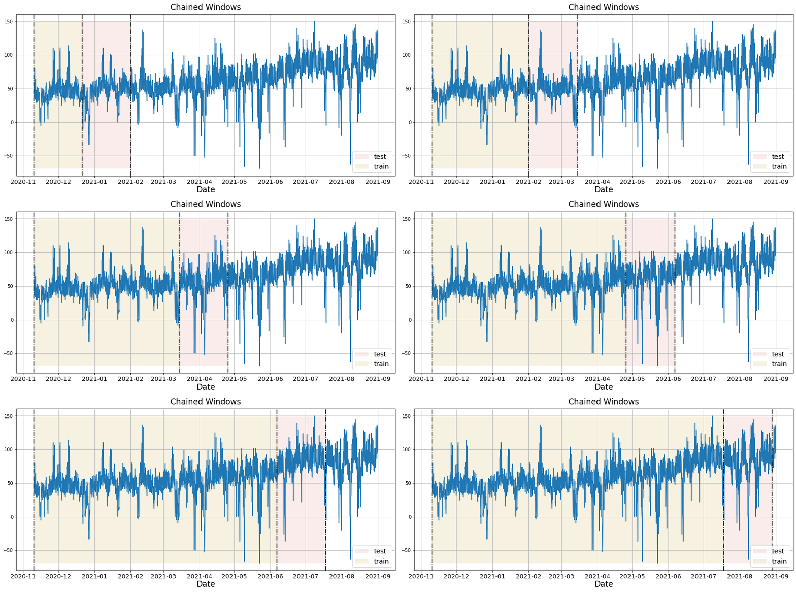
With time series data, Cross Validation is done by defining a sliding
window across the historical data and predicting the period following
it. This form of cross-validation allows us to arrive at a better
estimation of our model’s predictive abilities across a wider range of
temporal instances while also keeping the data in the training set
contiguous as is required by our models.
The following graph depicts such a Cross Validation Strategy:
### Perform time series cross-validation
Cross-validation of time series models is considered a best practice but
most implementations are very slow. The statsforecast library implements
cross-validation as a distributed operation, making the process less
time-consuming to perform. If you have big datasets you can also perform
Cross Validation in a distributed cluster using Ray, Dask or Spark.
In this case, we want to evaluate the performance of each model for the
last 5 months `(n_windows=)`, forecasting every second months
`(step_size=50)`. Depending on your computer, this step should take
around 1 min.
The cross\_validation method from the StatsForecast class takes the
following arguments.
* `df:` training data frame
* `h (int):` represents h steps into the future that are being
forecasted. In this case, 500 hours ahead.
* `step_size (int):` step size between each window. In other words:
how often do you want to run the forecasting processes.
* `n_windows(int):` number of windows used for cross validation. In
other words: what number of forecasting processes in the past do you
want to evaluate.
```python theme={null}
crossvalidation_df = sf.cross_validation(df=df,
h=horizon,
step_size=50,
n_windows=5)
```
The crossvaldation\_df object is a new data frame that includes the
following columns:
* `unique_id:` series identifier
* `ds:` datestamp or temporal index
* `cutoff:` the last datestamp or temporal index for the `n_windows`.
* `y:` true value
* `model:` columns with the model’s name and fitted value.
```python theme={null}
crossvalidation_df
```
| | unique\_id | ds | cutoff | y | CrostonOptimized |
| ---- | ---------- | ------------------- | ------------------- | ---- | ---------------- |
| 0 | 1 | 2023-01-23 12:00:00 | 2023-01-23 11:00:00 | 0.0 | 23.655830 |
| 1 | 1 | 2023-01-23 13:00:00 | 2023-01-23 11:00:00 | 0.0 | 23.655830 |
| 2 | 1 | 2023-01-23 14:00:00 | 2023-01-23 11:00:00 | 0.0 | 23.655830 |
| ... | ... | ... | ... | ... | ... |
| 2497 | 1 | 2023-02-21 13:00:00 | 2023-01-31 19:00:00 | 60.0 | 27.418417 |
| 2498 | 1 | 2023-02-21 14:00:00 | 2023-01-31 19:00:00 | 20.0 | 27.418417 |
| 2499 | 1 | 2023-02-21 15:00:00 | 2023-01-31 19:00:00 | 20.0 | 27.418417 |
## Model Evaluation
Now we are going to evaluate our model with the results of the
predictions, we will use different types of metrics MAE, MAPE, MASE,
RMSE, SMAPE to evaluate the accuracy.
```python theme={null}
from functools import partial
import utilsforecast.losses as ufl
from utilsforecast.evaluation import evaluate
```
```python theme={null}
evaluate(
test.merge(Y_hat),
metrics=[ufl.mae, ufl.mape, partial(ufl.mase, seasonality=season_length), ufl.rmse, ufl.smape],
train_df=train,
)
```
| | unique\_id | metric | CrostonOptimized |
| - | ---------- | ------ | ---------------- |
| 0 | 1 | mae | 33.704756 |
| 1 | 1 | mape | 0.632593 |
| 2 | 1 | mase | 0.804074 |
| 3 | 1 | rmse | 45.262709 |
| 4 | 1 | smape | 0.767960 |
# References
1. [Changquan Huang • Alla Petukhina. Springer series (2022). Applied
Time Series Analysis and Forecasting with
Python.](https://link.springer.com/book/10.1007/978-3-031-13584-2)
2. Ivan Svetunkov. [Forecasting and Analytics with the Augmented
Dynamic Adaptive Model (ADAM)](https://openforecast.org/adam/)
3. [James D. Hamilton. Time Series Analysis Princeton University Press,
Princeton, New Jersey, 1st Edition,
1994.](https://press.princeton.edu/books/hardcover/9780691042893/time-series-analysis)
4. [Nixtla CrostonOptimized
API](../../src/core/models.html#crostonoptimized)
5. [Pandas available
frequencies](https://pandas.pydata.org/pandas-docs/stable/user_guide/timeseries.html#offset-aliases).
6. [Rob J. Hyndman and George Athanasopoulos (2018). “Forecasting
Principles and Practice (3rd
ed)”](https://otexts.com/fpp3/tscv.html).
7. [Seasonal periods- Rob J
Hyndman](https://robjhyndman.com/hyndsight/seasonal-periods/).
### Predict method with confidence interval
To generate forecasts use the predict method.
The predict method takes two arguments: forecasts the next `h` (for
horizon) and `level`.
* `h (int):` represents the forecast h steps into the future. In this
case, 500 hours ahead.
The forecast object here is a new data frame that includes a column with
the name of the model and the y hat values, as well as columns for the
uncertainty intervals.
This step should take less than 1 second.
```python theme={null}
forecast_df = sf.predict(h=horizon)
forecast_df
```
| | unique\_id | ds | CrostonOptimized |
| --- | ---------- | ------------------- | ---------------- |
| 0 | 1 | 2023-01-31 20:00:00 | 27.418417 |
| 1 | 1 | 2023-01-31 21:00:00 | 27.418417 |
| 2 | 1 | 2023-01-31 22:00:00 | 27.418417 |
| ... | ... | ... | ... |
| 497 | 1 | 2023-02-21 13:00:00 | 27.418417 |
| 498 | 1 | 2023-02-21 14:00:00 | 27.418417 |
| 499 | 1 | 2023-02-21 15:00:00 | 27.418417 |
## Cross-validation
In previous steps, we’ve taken our historical data to predict the
future. However, to asses its accuracy we would also like to know how
the model would have performed in the past. To assess the accuracy and
robustness of your models on your data perform Cross-Validation.
With time series data, Cross Validation is done by defining a sliding
window across the historical data and predicting the period following
it. This form of cross-validation allows us to arrive at a better
estimation of our model’s predictive abilities across a wider range of
temporal instances while also keeping the data in the training set
contiguous as is required by our models.
The following graph depicts such a Cross Validation Strategy:

### Perform time series cross-validation
Cross-validation of time series models is considered a best practice but
most implementations are very slow. The statsforecast library implements
cross-validation as a distributed operation, making the process less
time-consuming to perform. If you have big datasets you can also perform
Cross Validation in a distributed cluster using Ray, Dask or Spark.
In this case, we want to evaluate the performance of each model for the
last 5 months `(n_windows=)`, forecasting every second months
`(step_size=50)`. Depending on your computer, this step should take
around 1 min.
The cross\_validation method from the StatsForecast class takes the
following arguments.
* `df:` training data frame
* `h (int):` represents h steps into the future that are being
forecasted. In this case, 500 hours ahead.
* `step_size (int):` step size between each window. In other words:
how often do you want to run the forecasting processes.
* `n_windows(int):` number of windows used for cross validation. In
other words: what number of forecasting processes in the past do you
want to evaluate.
```python theme={null}
crossvalidation_df = sf.cross_validation(df=df,
h=horizon,
step_size=50,
n_windows=5)
```
The crossvaldation\_df object is a new data frame that includes the
following columns:
* `unique_id:` series identifier
* `ds:` datestamp or temporal index
* `cutoff:` the last datestamp or temporal index for the `n_windows`.
* `y:` true value
* `model:` columns with the model’s name and fitted value.
```python theme={null}
crossvalidation_df
```
| | unique\_id | ds | cutoff | y | CrostonOptimized |
| ---- | ---------- | ------------------- | ------------------- | ---- | ---------------- |
| 0 | 1 | 2023-01-23 12:00:00 | 2023-01-23 11:00:00 | 0.0 | 23.655830 |
| 1 | 1 | 2023-01-23 13:00:00 | 2023-01-23 11:00:00 | 0.0 | 23.655830 |
| 2 | 1 | 2023-01-23 14:00:00 | 2023-01-23 11:00:00 | 0.0 | 23.655830 |
| ... | ... | ... | ... | ... | ... |
| 2497 | 1 | 2023-02-21 13:00:00 | 2023-01-31 19:00:00 | 60.0 | 27.418417 |
| 2498 | 1 | 2023-02-21 14:00:00 | 2023-01-31 19:00:00 | 20.0 | 27.418417 |
| 2499 | 1 | 2023-02-21 15:00:00 | 2023-01-31 19:00:00 | 20.0 | 27.418417 |
## Model Evaluation
Now we are going to evaluate our model with the results of the
predictions, we will use different types of metrics MAE, MAPE, MASE,
RMSE, SMAPE to evaluate the accuracy.
```python theme={null}
from functools import partial
import utilsforecast.losses as ufl
from utilsforecast.evaluation import evaluate
```
```python theme={null}
evaluate(
test.merge(Y_hat),
metrics=[ufl.mae, ufl.mape, partial(ufl.mase, seasonality=season_length), ufl.rmse, ufl.smape],
train_df=train,
)
```
| | unique\_id | metric | CrostonOptimized |
| - | ---------- | ------ | ---------------- |
| 0 | 1 | mae | 33.704756 |
| 1 | 1 | mape | 0.632593 |
| 2 | 1 | mase | 0.804074 |
| 3 | 1 | rmse | 45.262709 |
| 4 | 1 | smape | 0.767960 |
# References
1. [Changquan Huang • Alla Petukhina. Springer series (2022). Applied
Time Series Analysis and Forecasting with
Python.](https://link.springer.com/book/10.1007/978-3-031-13584-2)
2. Ivan Svetunkov. [Forecasting and Analytics with the Augmented
Dynamic Adaptive Model (ADAM)](https://openforecast.org/adam/)
3. [James D. Hamilton. Time Series Analysis Princeton University Press,
Princeton, New Jersey, 1st Edition,
1994.](https://press.princeton.edu/books/hardcover/9780691042893/time-series-analysis)
4. [Nixtla CrostonOptimized
API](../../src/core/models.html#crostonoptimized)
5. [Pandas available
frequencies](https://pandas.pydata.org/pandas-docs/stable/user_guide/timeseries.html#offset-aliases).
6. [Rob J. Hyndman and George Athanasopoulos (2018). “Forecasting
Principles and Practice (3rd
ed)”](https://otexts.com/fpp3/tscv.html).
7. [Seasonal periods- Rob J
Hyndman](https://robjhyndman.com/hyndsight/seasonal-periods/).