> ## Documentation Index
> Fetch the complete documentation index at: https://nixtlaverse.nixtla.io/llms.txt
> Use this file to discover all available pages before exploring further.
# Diagnostics
A prediction interval is a claim, and `conformalforecast.diagnostics` is
how you check it. This page covers the two ways to run an evaluation,
the metrics worth looking at, and the one measurement that will lie to
you.
## The two modes
Both take the fitted object a method’s `calibrate` / `calibrate_cv`
returns.
* **`evaluate(fitted, histories, truths)`** — roll the fitted object
over held-out windows it has never seen. This is the honest one.
* **`evaluate_calibration(fitted)`** — replay the method’s own
calibration data through the state its own calibration implied at
each window. Cheap, requires no holdout, and **in sample** — so it
is flattered by construction and does not track the target. Treat it
as a plumbing check, never as a result.
Both return a `Report`.
```python theme={null}
import matplotlib.pyplot as plt
import numpy as np
import pandas as pd
from statsforecast import StatsForecast
from statsforecast.models import AutoETS
from conformalforecast import (
AdaptiveConformalInference,
ConformalizedQuantileRegression,
SplitConformal,
)
from conformalforecast.adapters import StatsForecastAdapter
from conformalforecast.diagnostics import (
coverage_by_horizon,
coverage_by_series,
coverage_width_summary,
evaluate,
evaluate_calibration,
mean_interval_width,
rolling_coverage,
winkler_score,
)
HORIZON, SEASON, ALPHA = 12, 12, 0.1
df = pd.read_csv("nbs/data/air_passengers.csv", parse_dates=["ds"])
panel = df["y"].to_numpy()[None, :]
N_HOLDOUT = 5
train_end = panel.shape[1] - N_HOLDOUT * HORIZON
train_df = df.iloc[:train_end].reset_index(drop=True)
sf = StatsForecast(models=[AutoETS(season_length=SEASON)], freq="MS", n_jobs=1)
sf.fit(train_df)
forecaster = StatsForecastAdapter(
sf=sf, train_df=train_df, horizon=HORIZON, freq="MS", model_name="AutoETS"
)
histories, truths = [], []
for k in range(N_HOLDOUT):
end = panel.shape[1] - (N_HOLDOUT - k) * HORIZON
histories.append(panel[:, :end])
truths.append(panel[:, end : end + HORIZON])
truths = np.stack(truths, axis=1)
print("holdout truths", truths.shape, "(n_series, n_windows, horizon)")
```
```text theme={null}
holdout truths (1, 5, 12) (n_series, n_windows, horizon)
```
## The optimistic measurement
The two disagree, and the size of the gap is the point. Run both against
the same fitted method: `evaluate_calibration` replays the windows the
method calibrated on, `evaluate` rolls it over a holdout it has never
seen.
```python theme={null}
split = SplitConformal(alpha=ALPHA).calibrate_cv(forecaster, n_windows=24)
in_sample = evaluate_calibration(split)
out_of_sample = evaluate(split, histories, truths)
print(f"{'in sample (evaluate_calibration)':34s} {in_sample.marginal_coverage:6.1%}")
print(f"{'held out (evaluate)':34s} {out_of_sample.marginal_coverage:6.1%}")
print(f"{'target':34s} {1 - ALPHA:6.1%}")
```
```text theme={null}
in sample (evaluate_calibration) 95.8%
held out (evaluate) 76.7%
target 90.0%
```
Nineteen points apart, and the flattering number is the one that needs
no holdout. An interval that looks well above target on its own
calibration data is under-covering badly on data it has not seen.
> **`evaluate_calibration` is a smoke test, not a result**
>
> It scores the method on the very windows it calibrated on, so it is
> measuring how well a quantile fits the sample it was taken from. For
> split conformal the answer is “by construction, about right” — which
> tells you the plumbing works and nothing about whether the interval
> will hold next month.
>
> Online methods are flattered further still: the replay is in sample
> with respect to the state that adapted on that same stream. SPCI is
> the extreme case — its interval is conditional on the residual window
> immediately before the step, so its replay re-queries each window’s
> own history rather than broadcasting the final answer. Because its
> quantile regressors were fit on the very residual rows that replay
> then queries, the figure can sit near 100% while a holdout puts the
> same method well below target — so for SPCI in particular, do not read
> the number as coverage. Windows it cannot reach that way, the first
> `window_size` of each series, are excluded rather than counted as
> misses; `Report.n_evaluated_cells` says how many cells the numbers
> came from.
>
> Use it to check that a pipeline runs. Report `evaluate`.
## What a report contains
```python theme={null}
print(out_of_sample.summary())
```
```text theme={null}
Report — SplitConformal
target coverage: 0.900
marginal coverage: 0.767
coverage by horizon: [1.000, 1.000, 0.800, 1.000, 0.800, 0.400, 0.200, 0.200, 0.800, 1.000, 1.000, 1.000]
mean width: 86.871
mean Winkler score: 151.761
n_holdout_samples: 5
```
`summary()` is the human-readable digest. The `Report` object also
carries the raw `intervals`, `truths` and `points` arrays, so any metric
the module exposes can be recomputed from it — which is what the rest of
this page does.
## Coverage, sliced
Marginal coverage is one number over every cell. It is the headline, and
it hides the two things most likely to be wrong.
```python theme={null}
interval, truth = out_of_sample.intervals, out_of_sample.truths
by_horizon = coverage_by_horizon(interval, truth)
by_series = coverage_by_series(interval, truth)
print("by series ", np.round(by_series, 3))
print("by horizon", np.round(by_horizon, 3))
fig, ax = plt.subplots(figsize=(8, 3.2))
ax.bar(np.arange(1, HORIZON + 1), by_horizon, color="C0", alpha=0.8)
ax.axhline(1 - ALPHA, color="k", lw=1.2, ls="--", label=f"target {1 - ALPHA:.0%}")
ax.set_xlabel("horizon (months ahead)")
ax.set_ylabel("coverage")
ax.set_ylim(0, 1.05)
ax.set_title("Coverage is not uniform across the horizon")
ax.legend(fontsize=8, frameon=False)
fig.tight_layout()
```
```text theme={null}
by series [0.767]
by horizon [1. 1. 0.8 1. 0.8 0.4 0.2 0.2 0.8 1. 1. 1. ]
```
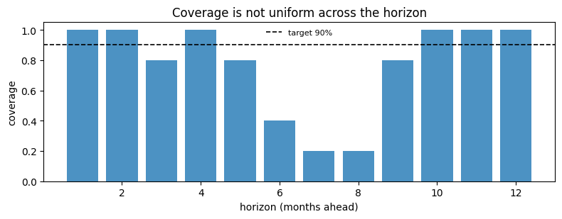 This is what “marginal, not conditional” means in practice. The 76.7%
headline is an average over wildly unequal parts: steps 1 to 5 and 9 to
12 are at or near 100%, while steps 7 and 8 cover 20%. Nothing about the
marginal figure would have told you that the interval essentially fails
at the summer peak.
If your decision depends on a specific lead time, that lead time’s bar
is your coverage — not the headline.
## Width, and why coverage alone is useless
A very large interval can cover everything, so any coverage number has
to be read next to a width.
```python theme={null}
widths = mean_interval_width(interval)
print("mean width per (series, horizon):", np.round(widths[0], 1))
summary = coverage_width_summary(interval, truth, alpha=ALPHA)
for key, value in summary.items():
print(f"{key:20s} {value:9.3f}")
```
```text theme={null}
mean width per (series, horizon): [ 51.2 54. 63.5 70. 78.1 85.2 89.3 102.8 104.3 109.7 113.6 120.7]
marginal_coverage 0.767
target_coverage 0.900
mean_width 86.871
mean_winkler 151.761
```
The **Winkler score** puts both on one scale: it charges the width of
the interval, plus a penalty of `2/alpha` times how far outside it the
truth landed. Lower is better, and unlike coverage it cannot be gamed by
widening.
```python theme={null}
scores = winkler_score(interval, truth, alpha=ALPHA)
print("Winkler per cell:", scores.shape, "-> mean", scores.mean().round(1))
```
```text theme={null}
Winkler per cell: (1, 5, 12) -> mean 151.8
```
## Comparing methods
The point of a single-number score is that it ranks. Here are three
methods on the same holdout.
```python theme={null}
cqr = ConformalizedQuantileRegression(alpha=ALPHA).calibrate_cv(forecaster, n_windows=24)
aci = AdaptiveConformalInference(alpha=ALPHA, gamma=0.01).calibrate_cv(forecaster, n_windows=24)
reports = {}
for name, candidate in [("SplitConformal", split), ("CQR", cqr), ("ACI", aci)]:
reports[name] = evaluate(candidate, histories, truths)
print(f"{'method':16s}{'coverage':>10s}{'width':>10s}{'Winkler':>10s}")
for name, report in reports.items():
print(
f"{name:16s}{report.marginal_coverage:9.1%}"
f"{report.mean_interval_width:10.1f}{report.mean_winkler_score:10.1f}"
)
```
```text theme={null}
method coverage width Winkler
SplitConformal 76.7% 86.9 151.8
CQR 88.3% 108.1 136.6
ACI 80.0% 91.3 135.0
```
```python theme={null}
fig, ax = plt.subplots(figsize=(6, 4))
for i, (name, report) in enumerate(reports.items()):
ax.scatter(
report.mean_interval_width,
report.marginal_coverage,
s=90,
color=f"C{i}",
label=name,
zorder=3,
)
ax.annotate(
name,
(report.mean_interval_width, report.marginal_coverage),
textcoords="offset points",
xytext=(8, -3),
fontsize=8,
)
ax.axhline(1 - ALPHA, color="k", lw=1.2, ls="--")
ax.text(ax.get_xlim()[0], 1 - ALPHA, " target", va="bottom", fontsize=8)
ax.set_xlabel("mean interval width")
ax.set_ylabel("marginal coverage")
ax.set_title("Up and to the left is better")
fig.tight_layout()
```
This is what “marginal, not conditional” means in practice. The 76.7%
headline is an average over wildly unequal parts: steps 1 to 5 and 9 to
12 are at or near 100%, while steps 7 and 8 cover 20%. Nothing about the
marginal figure would have told you that the interval essentially fails
at the summer peak.
If your decision depends on a specific lead time, that lead time’s bar
is your coverage — not the headline.
## Width, and why coverage alone is useless
A very large interval can cover everything, so any coverage number has
to be read next to a width.
```python theme={null}
widths = mean_interval_width(interval)
print("mean width per (series, horizon):", np.round(widths[0], 1))
summary = coverage_width_summary(interval, truth, alpha=ALPHA)
for key, value in summary.items():
print(f"{key:20s} {value:9.3f}")
```
```text theme={null}
mean width per (series, horizon): [ 51.2 54. 63.5 70. 78.1 85.2 89.3 102.8 104.3 109.7 113.6 120.7]
marginal_coverage 0.767
target_coverage 0.900
mean_width 86.871
mean_winkler 151.761
```
The **Winkler score** puts both on one scale: it charges the width of
the interval, plus a penalty of `2/alpha` times how far outside it the
truth landed. Lower is better, and unlike coverage it cannot be gamed by
widening.
```python theme={null}
scores = winkler_score(interval, truth, alpha=ALPHA)
print("Winkler per cell:", scores.shape, "-> mean", scores.mean().round(1))
```
```text theme={null}
Winkler per cell: (1, 5, 12) -> mean 151.8
```
## Comparing methods
The point of a single-number score is that it ranks. Here are three
methods on the same holdout.
```python theme={null}
cqr = ConformalizedQuantileRegression(alpha=ALPHA).calibrate_cv(forecaster, n_windows=24)
aci = AdaptiveConformalInference(alpha=ALPHA, gamma=0.01).calibrate_cv(forecaster, n_windows=24)
reports = {}
for name, candidate in [("SplitConformal", split), ("CQR", cqr), ("ACI", aci)]:
reports[name] = evaluate(candidate, histories, truths)
print(f"{'method':16s}{'coverage':>10s}{'width':>10s}{'Winkler':>10s}")
for name, report in reports.items():
print(
f"{name:16s}{report.marginal_coverage:9.1%}"
f"{report.mean_interval_width:10.1f}{report.mean_winkler_score:10.1f}"
)
```
```text theme={null}
method coverage width Winkler
SplitConformal 76.7% 86.9 151.8
CQR 88.3% 108.1 136.6
ACI 80.0% 91.3 135.0
```
```python theme={null}
fig, ax = plt.subplots(figsize=(6, 4))
for i, (name, report) in enumerate(reports.items()):
ax.scatter(
report.mean_interval_width,
report.marginal_coverage,
s=90,
color=f"C{i}",
label=name,
zorder=3,
)
ax.annotate(
name,
(report.mean_interval_width, report.marginal_coverage),
textcoords="offset points",
xytext=(8, -3),
fontsize=8,
)
ax.axhline(1 - ALPHA, color="k", lw=1.2, ls="--")
ax.text(ax.get_xlim()[0], 1 - ALPHA, " target", va="bottom", fontsize=8)
ax.set_xlabel("mean interval width")
ax.set_ylabel("marginal coverage")
ax.set_title("Up and to the left is better")
fig.tight_layout()
```
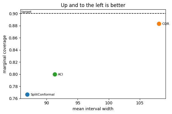 Read this plot the way you would read a Pareto front: up is valid, left
is useful, and the dashed line is the promise you made.
All three sit below it here, which is the honest outcome — AirPassengers
trends hard, five years of holdout is a genuine distribution shift, and
no method on this page gets a free pass from that. The ranking is still
informative, and nothing dominates: split conformal is the narrowest
(86.9) and covers worst (76.7%), CQR covers best (88.3%) and is the
widest (108.1), and ACI sits between them on both. ACI wins the Winkler
score because a 5% width premium over split conformal bought it a
3-point coverage gain, and Winkler prices that trade for you. That is
the argument for a scalar score: the scatter shows you there is a
trade-off, and the score tells you which side of it to be on.
## Coverage over time
For an online method the question is not “what was the coverage” but
“when was it wrong”. `rolling_coverage` answers that, with one shape
subtlety worth knowing first.
```python theme={null}
aci_report = reports["ACI"]
print("intervals", aci_report.intervals.shape, " truths", aci_report.truths.shape)
print(
"rolling_coverage ->", rolling_coverage(aci_report.intervals, aci_report.truths, window=3).shape
)
```
```text theme={null}
intervals (1, 5, 12, 2) truths (1, 5, 12)
rolling_coverage -> (1, 3, 12)
```
It reduces the **samples** axis and leaves the horizon axis alone:
`(n_series, n_samples - window + 1, horizon)`. Five holdout windows with
a window of 3 therefore gives 3 values for *each* of the 12 horizon
steps, not one line.
What we want is calendar time. The five holdout windows are contiguous,
non-overlapping 12-month blocks in chronological order, so their 60
cells *are* the last 60 months of the series. Reshaping to one month per
sample turns the rolling window into a rolling **year**.
```python theme={null}
# Each holdout window is the 12 months following the previous one, so flattening
# (window, horizon) recovers the last 60 months in order.
months_iv = aci_report.intervals.reshape(1, -1, 1, 2)
months_truth = aci_report.truths.reshape(1, -1, 1)
np.testing.assert_allclose(months_truth[0, :, 0], panel[0, train_end:])
window = 12
rolling = rolling_coverage(months_iv, months_truth, window=window)[0, :, 0]
print(f"{rolling.size} rolling values, from {rolling.min():.0%} to {rolling.max():.0%}")
fig, ax = plt.subplots(figsize=(8, 3.2))
ax.plot(np.arange(rolling.size), rolling, color="C2", lw=1.6)
ax.axhline(1 - ALPHA, color="k", lw=1.2, ls="--", label=f"target {1 - ALPHA:.0%}")
ax.set_xlabel(f"months into the holdout ({window}-month trailing window)")
ax.set_ylabel("coverage")
ax.set_ylim(0, 1.05)
ax.set_title("ACI coverage over the holdout, one point per month")
ax.legend(fontsize=8, frameon=False, loc="lower left")
fig.tight_layout()
```
```text theme={null}
49 rolling values, from 50% to 100%
```
Read this plot the way you would read a Pareto front: up is valid, left
is useful, and the dashed line is the promise you made.
All three sit below it here, which is the honest outcome — AirPassengers
trends hard, five years of holdout is a genuine distribution shift, and
no method on this page gets a free pass from that. The ranking is still
informative, and nothing dominates: split conformal is the narrowest
(86.9) and covers worst (76.7%), CQR covers best (88.3%) and is the
widest (108.1), and ACI sits between them on both. ACI wins the Winkler
score because a 5% width premium over split conformal bought it a
3-point coverage gain, and Winkler prices that trade for you. That is
the argument for a scalar score: the scatter shows you there is a
trade-off, and the score tells you which side of it to be on.
## Coverage over time
For an online method the question is not “what was the coverage” but
“when was it wrong”. `rolling_coverage` answers that, with one shape
subtlety worth knowing first.
```python theme={null}
aci_report = reports["ACI"]
print("intervals", aci_report.intervals.shape, " truths", aci_report.truths.shape)
print(
"rolling_coverage ->", rolling_coverage(aci_report.intervals, aci_report.truths, window=3).shape
)
```
```text theme={null}
intervals (1, 5, 12, 2) truths (1, 5, 12)
rolling_coverage -> (1, 3, 12)
```
It reduces the **samples** axis and leaves the horizon axis alone:
`(n_series, n_samples - window + 1, horizon)`. Five holdout windows with
a window of 3 therefore gives 3 values for *each* of the 12 horizon
steps, not one line.
What we want is calendar time. The five holdout windows are contiguous,
non-overlapping 12-month blocks in chronological order, so their 60
cells *are* the last 60 months of the series. Reshaping to one month per
sample turns the rolling window into a rolling **year**.
```python theme={null}
# Each holdout window is the 12 months following the previous one, so flattening
# (window, horizon) recovers the last 60 months in order.
months_iv = aci_report.intervals.reshape(1, -1, 1, 2)
months_truth = aci_report.truths.reshape(1, -1, 1)
np.testing.assert_allclose(months_truth[0, :, 0], panel[0, train_end:])
window = 12
rolling = rolling_coverage(months_iv, months_truth, window=window)[0, :, 0]
print(f"{rolling.size} rolling values, from {rolling.min():.0%} to {rolling.max():.0%}")
fig, ax = plt.subplots(figsize=(8, 3.2))
ax.plot(np.arange(rolling.size), rolling, color="C2", lw=1.6)
ax.axhline(1 - ALPHA, color="k", lw=1.2, ls="--", label=f"target {1 - ALPHA:.0%}")
ax.set_xlabel(f"months into the holdout ({window}-month trailing window)")
ax.set_ylabel("coverage")
ax.set_ylim(0, 1.05)
ax.set_title("ACI coverage over the holdout, one point per month")
ax.legend(fontsize=8, frameon=False, loc="lower left")
fig.tight_layout()
```
```text theme={null}
49 rolling values, from 50% to 100%
```
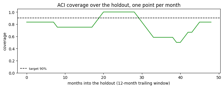 Coverage sits in the low 80s for the first year and a half, touches 100%
around months 20 to 28, then falls away to 50% by month 40 before
recovering. The 80% marginal figure is the average of all of that, and
it would never have told you that there is a stretch in the middle of
the holdout where half the observations landed outside a 90% interval.
That is the shape a method losing its calibration makes: fine while the
future resembles the calibration set, worse as the trend pulls away. The
obvious response is to raise ACI’s learning rate so it reacts faster,
and the [ACI page](../methods/aci) measures what that buys and what it
costs: pushed far enough, `alpha_t` is driven to zero, the interval
widens without bound, and the coverage is bought by predicting
“somewhere between minus and plus infinity”. [AgACI](../methods/agaci)
is the sturdier answer — it runs several learning rates at once and lets
an aggregator discard the ones that blow up.
> **This view mixes lead times**
>
> Flattening blends the 1-month-ahead cell of each block with its
> 12-month-ahead cell, so a dip may be a bad month or a bad lead time.
> That is the right view for “how did the deployed interval behave over
> the year”, which is what a pipeline re-forecasting annually actually
> experiences, and the wrong view for isolating a horizon step —
> `coverage_by_horizon` is for that. When every prediction shares one
> lead time, as on the [online updating](online-updating) page, the
> distinction disappears and `rolling_coverage` needs no reshape.
## Everything else in the module
Not shown above, but available and documented in the diagnostics API
reference:
* `coverage_per_cell` — the full `(n_series, horizon)` grid behind the
two reductions used here.
* `coverage_by_magnitude_bin` — coverage against the size of the
truth, which finds the “we only miss on big values” failure.
* `coverage_by_group` — coverage against any grouping you supply, for
panels with categories.
* `pinball_loss` — per-quantile loss, for comparing quantile forecasts
directly.
* `method_state` and its per-method siblings `aci_state`,
`agaci_state`, `nexcp_state`, `spci_state` — the internal state of
an online method, used on the [ACI](../methods/aci) and
[AgACI](../methods/agaci) pages.
## Next
* [Methods overview](../methods/index) — choosing what to measure.
* [Online updating](online-updating) — keeping a method honest as data
arrives.
* [Ragged panels](ragged-panels) — per-series diagnostics when series
differ in length.
## Related topics
- [Diagnostics](/conformalforecast/diagnostics.html.md)
- [Reconciliation Diagnostics](/hierarchicalforecast/examples/reconciliationdiagnostics.html.md)
- [Quick Start | HierarchicalForecast](/hierarchicalforecast/examples/tourismsmall.html.md)
- [Corpus evaluation](/synforecast/evaluation.html.md)
- [Ragged panels](/conformalforecast/docs/capabilities/ragged-panels.html.md)
Coverage sits in the low 80s for the first year and a half, touches 100%
around months 20 to 28, then falls away to 50% by month 40 before
recovering. The 80% marginal figure is the average of all of that, and
it would never have told you that there is a stretch in the middle of
the holdout where half the observations landed outside a 90% interval.
That is the shape a method losing its calibration makes: fine while the
future resembles the calibration set, worse as the trend pulls away. The
obvious response is to raise ACI’s learning rate so it reacts faster,
and the [ACI page](../methods/aci) measures what that buys and what it
costs: pushed far enough, `alpha_t` is driven to zero, the interval
widens without bound, and the coverage is bought by predicting
“somewhere between minus and plus infinity”. [AgACI](../methods/agaci)
is the sturdier answer — it runs several learning rates at once and lets
an aggregator discard the ones that blow up.
> **This view mixes lead times**
>
> Flattening blends the 1-month-ahead cell of each block with its
> 12-month-ahead cell, so a dip may be a bad month or a bad lead time.
> That is the right view for “how did the deployed interval behave over
> the year”, which is what a pipeline re-forecasting annually actually
> experiences, and the wrong view for isolating a horizon step —
> `coverage_by_horizon` is for that. When every prediction shares one
> lead time, as on the [online updating](online-updating) page, the
> distinction disappears and `rolling_coverage` needs no reshape.
## Everything else in the module
Not shown above, but available and documented in the diagnostics API
reference:
* `coverage_per_cell` — the full `(n_series, horizon)` grid behind the
two reductions used here.
* `coverage_by_magnitude_bin` — coverage against the size of the
truth, which finds the “we only miss on big values” failure.
* `coverage_by_group` — coverage against any grouping you supply, for
panels with categories.
* `pinball_loss` — per-quantile loss, for comparing quantile forecasts
directly.
* `method_state` and its per-method siblings `aci_state`,
`agaci_state`, `nexcp_state`, `spci_state` — the internal state of
an online method, used on the [ACI](../methods/aci) and
[AgACI](../methods/agaci) pages.
## Next
* [Methods overview](../methods/index) — choosing what to measure.
* [Online updating](online-updating) — keeping a method honest as data
arrives.
* [Ragged panels](ragged-panels) — per-series diagnostics when series
differ in length.
## Related topics
- [Diagnostics](/conformalforecast/diagnostics.html.md)
- [Reconciliation Diagnostics](/hierarchicalforecast/examples/reconciliationdiagnostics.html.md)
- [Quick Start | HierarchicalForecast](/hierarchicalforecast/examples/tourismsmall.html.md)
- [Corpus evaluation](/synforecast/evaluation.html.md)
- [Ragged panels](/conformalforecast/docs/capabilities/ragged-panels.html.md)